Art direction
Kierunek projektu
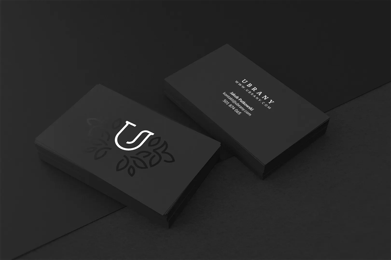
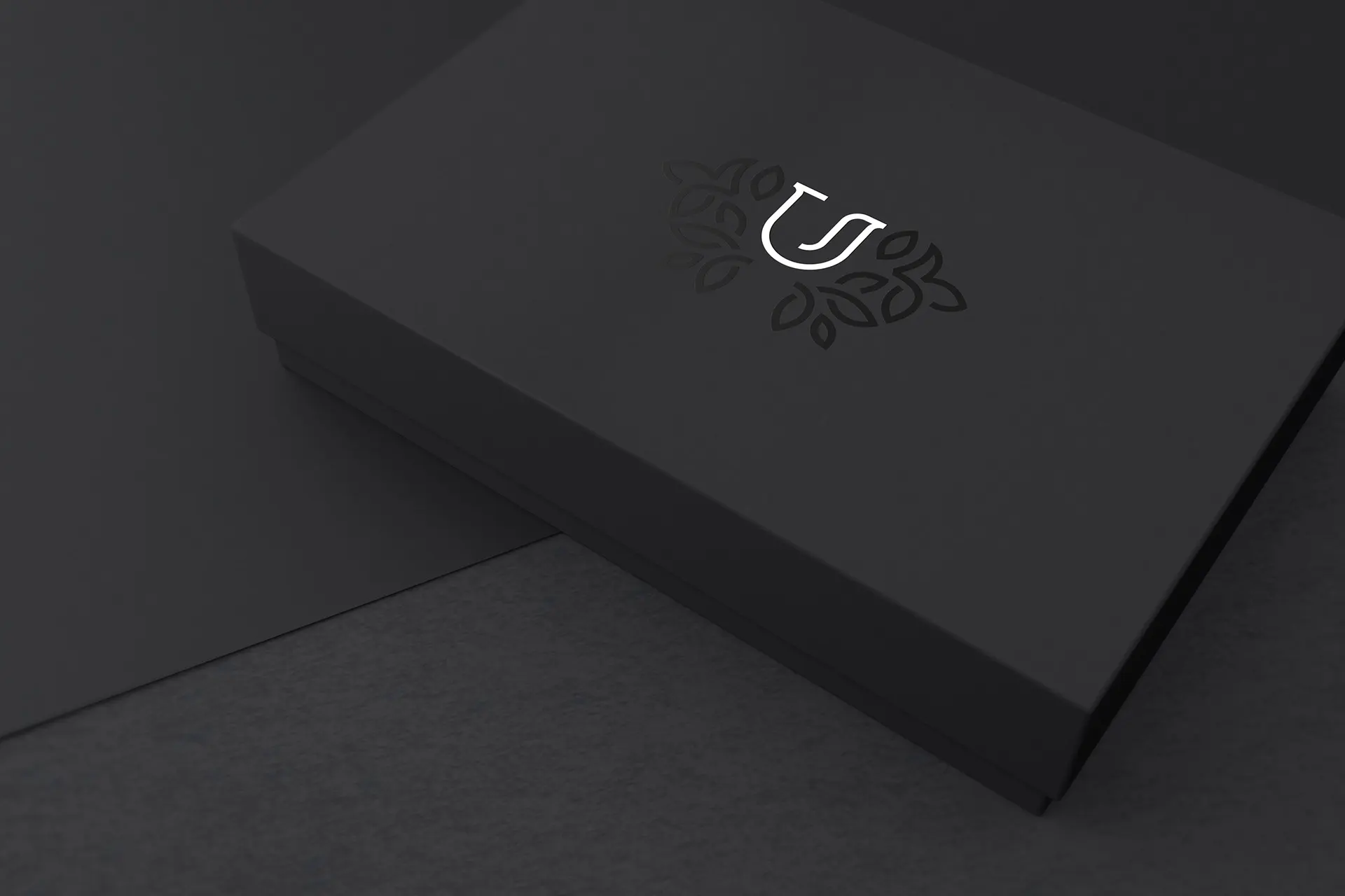
In June 2017 I received a branding request for a company called "UBRANY" (Eng – DRESSED) who deal with online sales of garments for men. My input included logotype design, creating a business card as well as a packaging prototype. Due to the fairly literal name of the company, I decided to abstain from using any obvious design elements in the logo (eg. Bow tie, tie, suit). The logotype was made solely of the letter "U".
W czerwcu 2017 otrzymałem zlecenie przygotowania identyfikacji wizualnej dla firmy „UBRANY” zajmującej się sprzedażą internetową galanterii męskiej. Wynik mojej pracy obejmował logotyp, wizytówki oraz projekt przykładowych opakowań. Kolokwialna nazwa dosadnie podkreśla, czym zajmuje się firma, dlatego postanowiłem nie tworzyć kolejnego banalnego loga krawatu bądź muszki. Logotyp to litera „U”.
Golden ratio
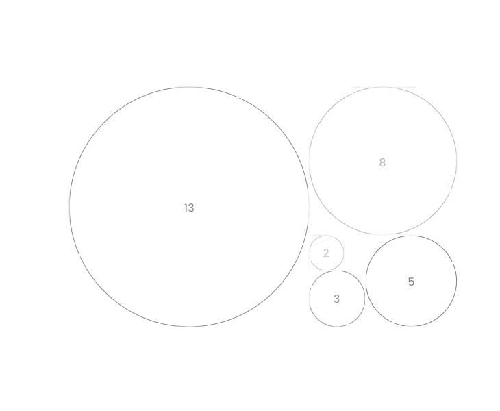
Logotype was created using golden ratio. Golden ratio, also known as the Golden Mean, the Golden Section, describes the perfectly symmetrical relationship between two proportions. Could be illustrated by golden rectangle below.
Złota proporcja
Logotyp został zaprojektowany przy zachowaniu złotej proporcji. Złota proporcja nazywana również podziałem harmonicznym, boską proporcjom jest współczynnikiem matematycznym. Można ją zilustrować za pomocą złotego prostokąta poniżej.
Area of isolation
The logo should always be surrounded by an area of clear space to ensure no other logos, text or graphic elements overpower it. This blank space is called an 'area of isolation'. This is to keep the logo legible on all surfaces where it will be used. Area of isolation is calculated using an 'X' value. 'X' is a distance between the logo shape and the typography or other objects. The minimum area of isolation is 1 'X' around the logo shape.
Pole ochronne znaku
Logo powinno być zawsze otoczone czystą przestrzenią, w której nie może się znaleźć żadne inne logo, tekst czy jakakolwiek grafika. Przestrzeń ta nazywana jest "polem ochronnym znaku". Ma to na celu zachowanie czytelności logo na wszelkich powierzchniach, na których będzie ono stosowane. Pole ochronne znaku jest obliczanie na podstawie 'X'. Wartość 'X' to dokładna odległość pomiędzy kształtem logo a tekstem bądź innym obiektem. Minimalne pole ochronne to 1 'X' dookoła logo.